Google Design Challenge
This is the google design challenge 2019. After applying to Google's summer UX design internship position, I received an email with this challenge. Challenge accepted! Here's the prompt I chose:
"Design an experience for students to discover orientation events and craft a visual system to accommodate different types of events: sports, music, visual arts, social groups, and volunteering events. Provide high-fidelity mocks for searching, browsing, and viewing the details for these different events."
My interpretation of this prompt:
- An experience - having contact and leaving an impression
- Discover orientation events - a channel to receive information
- A visual system - information is processed by human eyes
- Different types of events - diversity and inclusion
In this challenge, I conducted user research, defined the problem, created persona, mapped user journey, drew sketches, designed wireframes and finally present to you my high fidelity mock ups. Let me walk you through all of the process!
------
Ideation
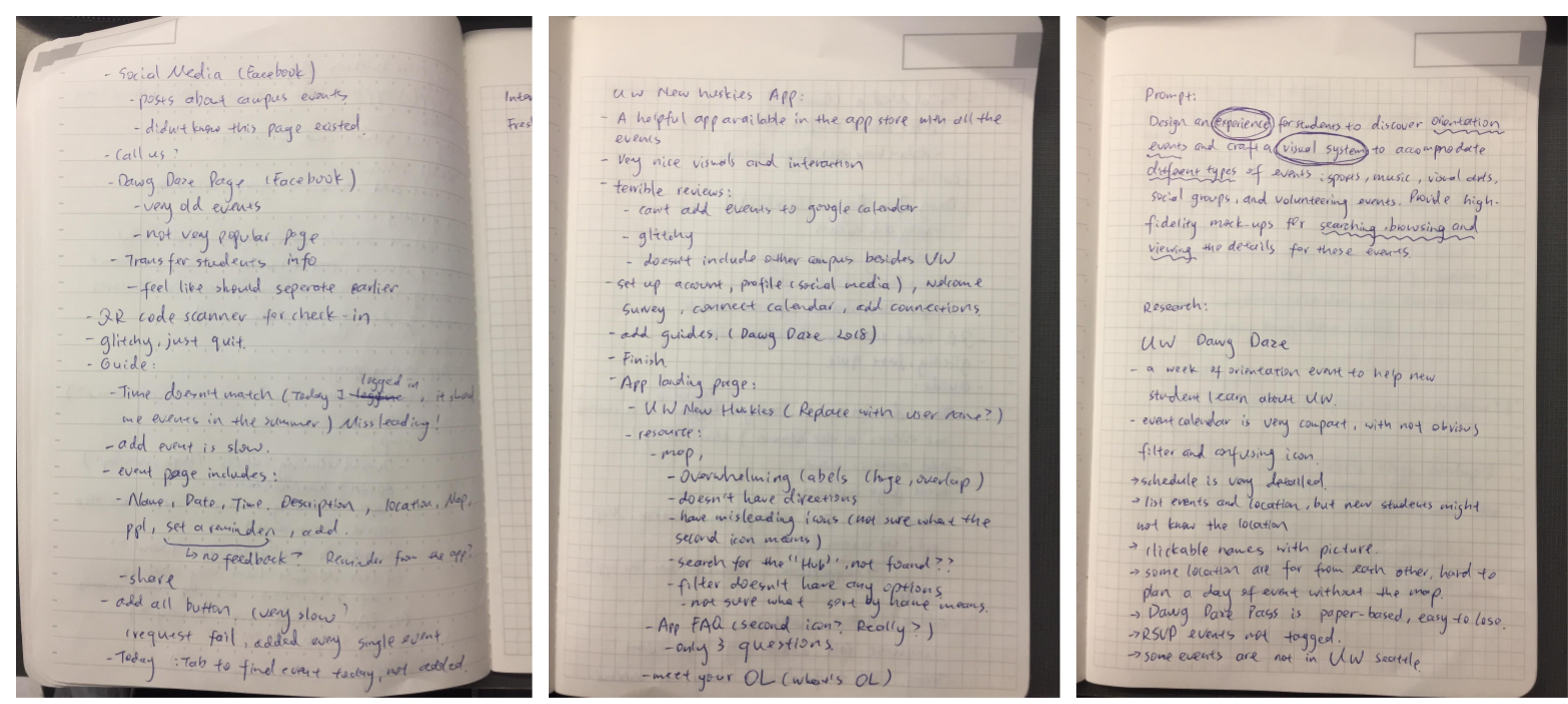
The first thing came to my mind was UW(University of Washington) Dawg Daze - a week long orientation for new students to explore the campus. I browse through the website and listed out things I liked and didn't like. There's a mobile app paired with the website. I also interviewed some people who attended Dawg Daze this year.
------
Personas
.png)
My plan to achieve Rachel's goal:
- Categorize events by type
- Provide visual guidance
- Increase the sense of belonging
------
Sketches and User Journey
.png)
I did a couple of sketches to meet the goals. From this exercise, I formed an idea of what kind of information to present and how to organize information.
------
Here's a user journal for our user, Rachel.
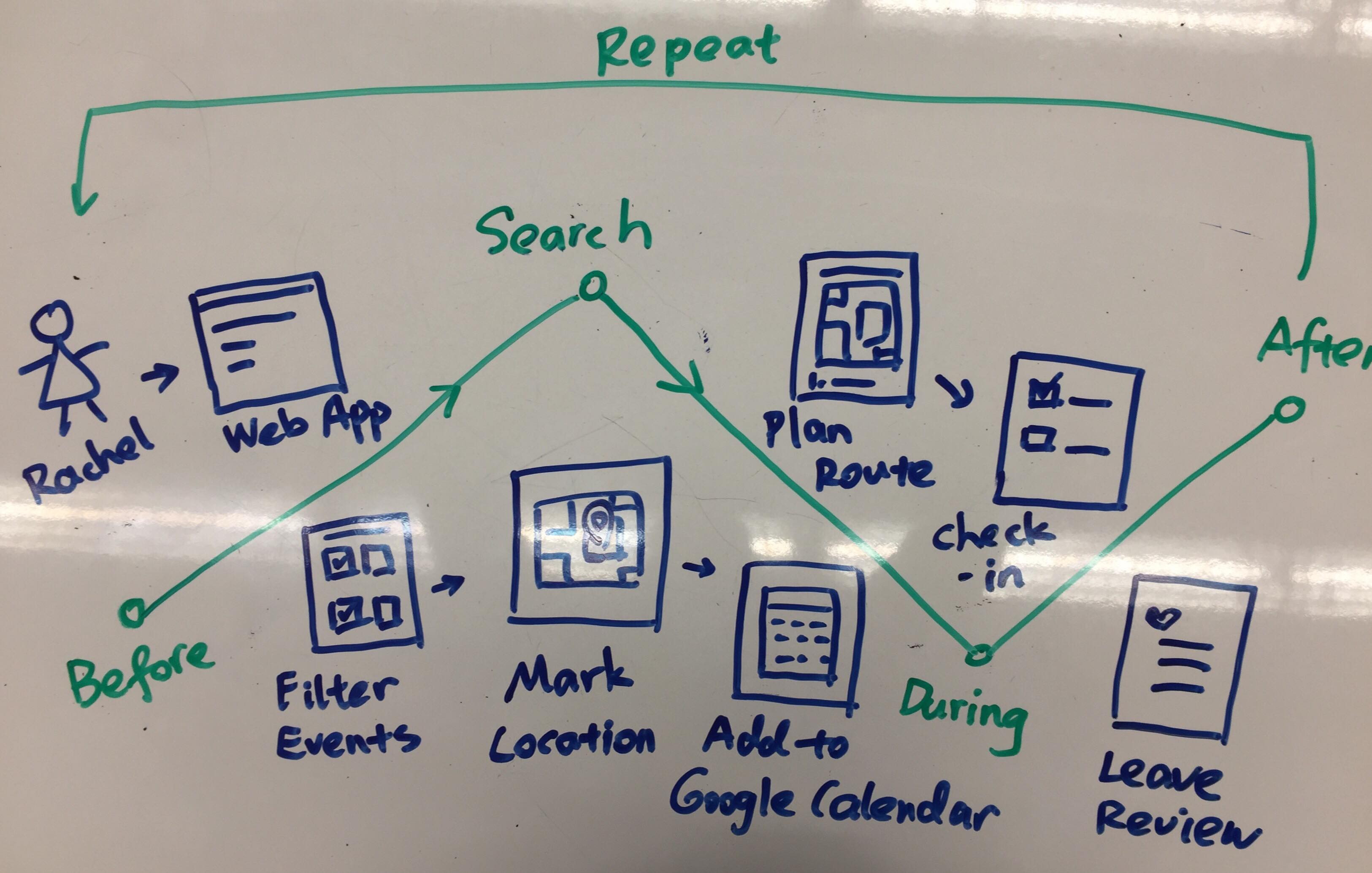
Before orientation :
- Rachel opens the orientation web app and logs in to her student account
Search:
- Rachel filters through the events by type and she found an archery class
- She convinced her friends to go with her, so she saved the event to her plan
- All the saved events auto sync to her Google Calendar
During orientation day 1:
- Rachel opens Google Calendar and plans route to archery using Google Maps
- Google Calendar check in for her when she arrives and it syncs with the school system
After orientation day 1:
- Rachel made some new friends from the archery event
- She really likes her experience, so she decides to check out archery club when school starts
- She left a review on the web app to help future students discover new events
Repeat for the next orientation day
------
Quick Reflection
Planning a user journey to see the steps Rachel takes in the web app helps me structure the user flow.
Initially when I was drawing the user journey, I thought Rachel would "Mark the location", but I realize it's easier if she saves the event to Google Calendar and use Google Map for direction. However, I still think this event will help Rachel learn some of the building names on campus.
When Rachel arrives at an event, the receptionists will ask Rachel for her husky card(student ID) which will record that she checked in this place. I think in a bigger scope, the school can promote a school wide stamp collection competition. If a student checked in at all the secret stamp station, he/she get some kind of awards.
------
Wireframe
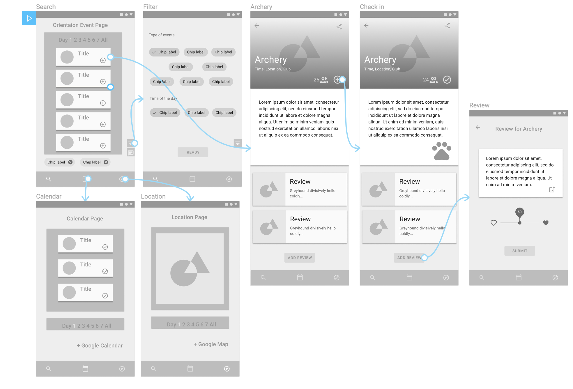
The wireframes you see above are the redesign for UW Dawg Daze website. My approach is mobile-first design, so all the screens you seen are from the view of Android mobile devices. Another reason I decide to redesign web app instead of a mobile app is that most users only use this page during orientation week, but they use Google Calendar and Google Map in daily basis. I think combining these tools can reduce the amount of time and energy. It's also cheaper to maintain a web page without the app.
The three functionalities I present above are the searching, browsing and viewing of the orientation events.
Some design guidelines I followed:
- Place user interactions on the bottom of the screen(closer to the thumb)
- Candid display of information
- Unified screen layout
- Follow the design guideline of Google Material
All the screens has bottom navigation:
- search
- calendar
- map
The reason I chose these 3 is because I want to help users like Rachel to search for events, save events and have the option to view events by time in the calendar or by location in the map. This design rationale is to meet Rachel's request of familiarize with the campus and potentially finding class location. An improvement for this design is to add tags to the events that are hosted in the building Rachel will have class in.
Now let's talk break down the functions and see how Rachel can benefit from this redesign:
------
Searching and Browsing
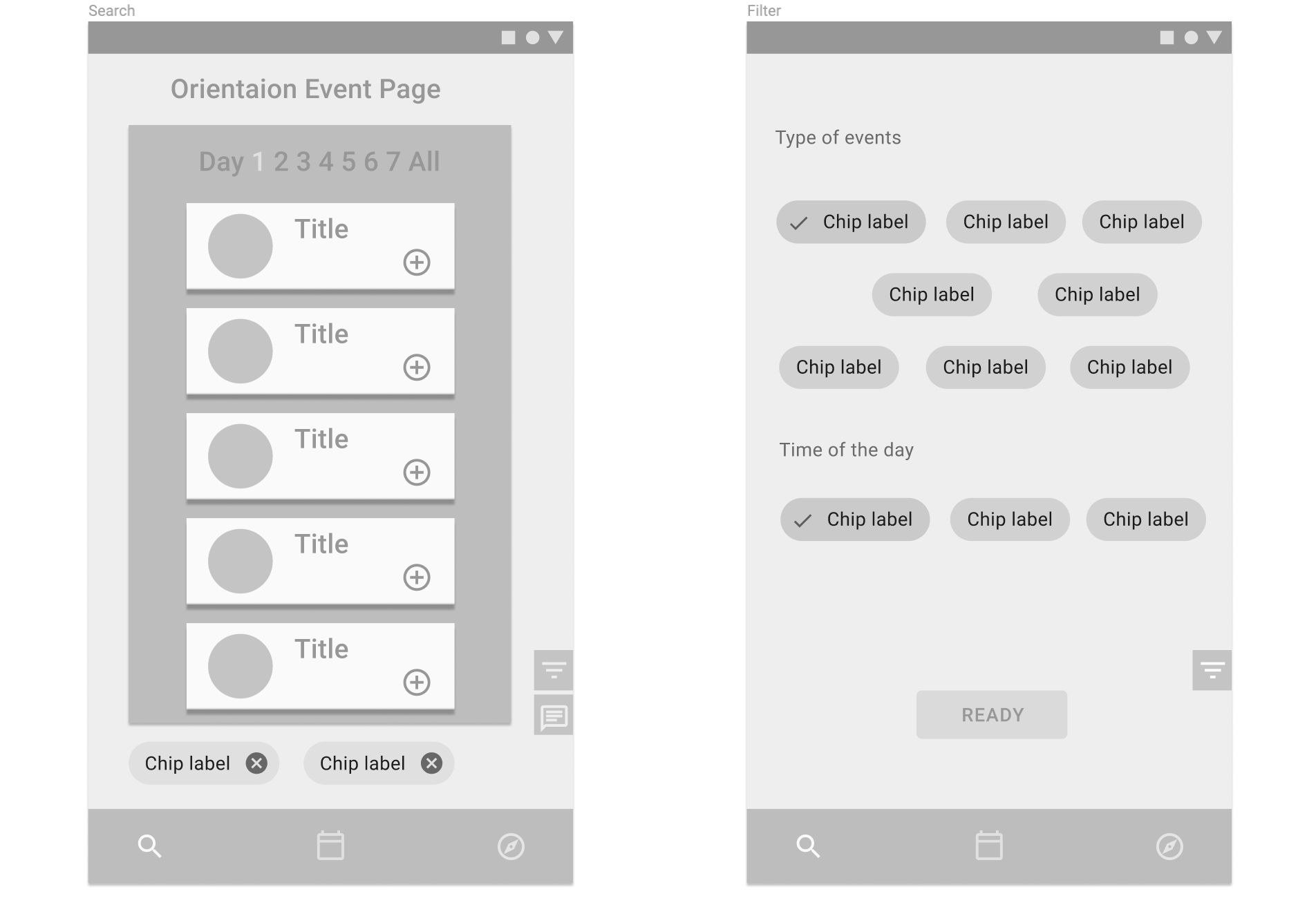
As soon as Rachel land in the Search page, she will see the events listed in orders of time. The pagination on the top helps Rachel to see event by day and serves as a bookmark when she scrolls through all the events. I kept all the events on the same page so that Rachel don't have to jump around pages and reload page. But if she wants to view the events of a specific day, she can click on the number and it will autoscroll to these events.
Each event card contains a picture, a creative name of the event and add button. If Rachel is looking for a specific type of event, she can click on the filter icon on the bottom right of the page. I put the filter there so she can use her thumb without reaching all the way to the top.
The little chat icon is for feedbacks or questions. If Rachel can't find the type of events she wants, she can request the new type use the chat icon.
There're only two filters: type of event and day of the time. Based on user research, new students don't really care about the location, but they do care about discovering new experiences. My design let Rachel choose the type of events such as sports, music and others. It will also display on the event page whether it's organized by a club. This design is to help users like Rachel to both find a new club and make new friends.
When Rachel clicks on the filter chip, a check mark shows up. If she wants to remove the chip, she can click on it again, the check mark will disappear. Another way to remove a filter chip is to click on the "X" mark on the chip in the search page. I chose filter chips because it's interactive and easy to use.
Only events that fit user's filter will be shown on the result.
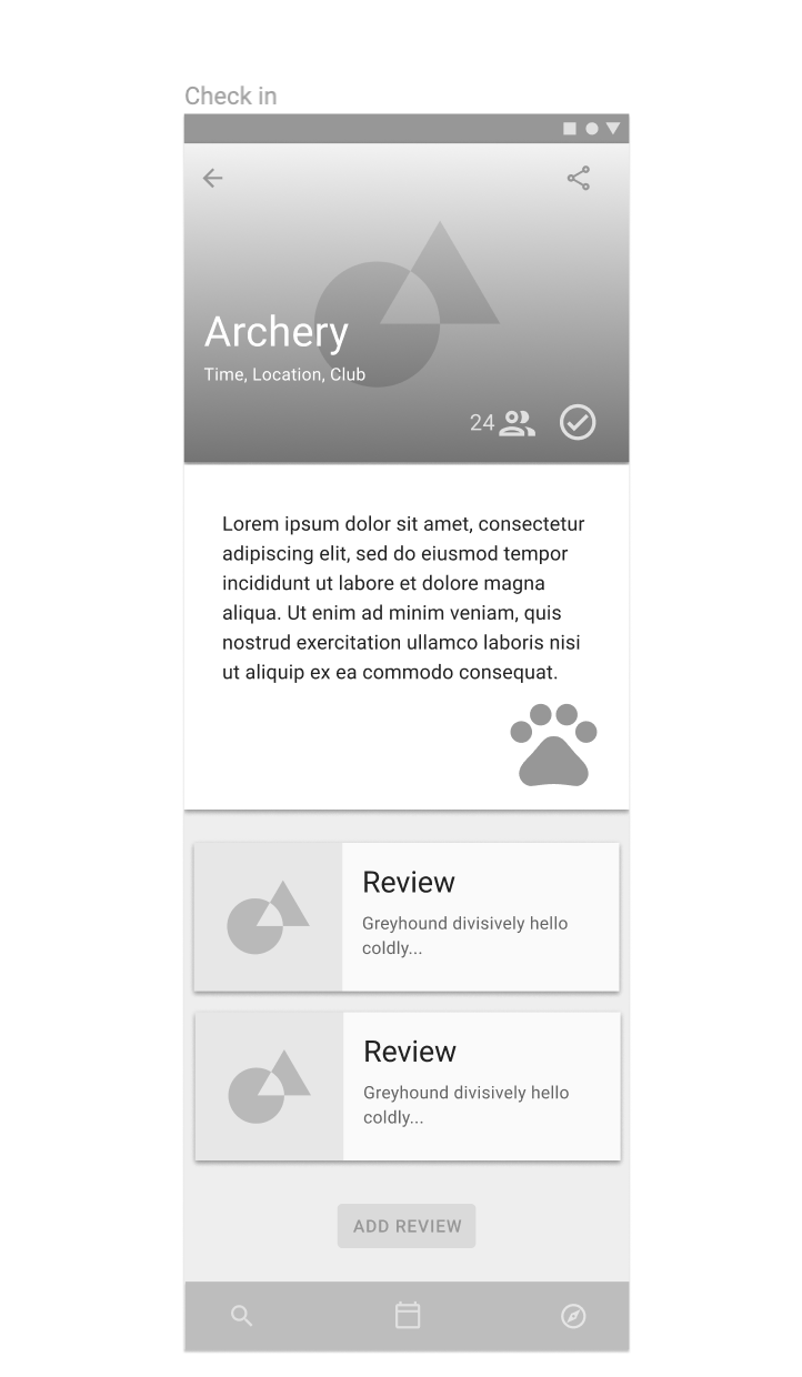
The current UW orientation page only shows a short description and an irrelevant picture for each event. My design is to expand on the current design by including the organization name(a club, department or school association) and the link to it. This design is to meet Rachel's goal of connecting with on campus organizations.
The people icon on the page will also show the current available spots. Using numbers explicitly will also increase the desire of people to sign up due to the fear of missing out. For the high fidelity prototype, I might include the total capacity too.
The check mark shows that Rachel has saved this event on her calendar.
If you've noticed the big dog pawn print on the screen, it's serving as a sign in mark. Once Rachel arrives at the event, she will be asked to show her Student ID. The school system will automatically check her in. If the school has enough budget to do a scavenger hunt, maybe Rachel will win free dining credits.
Viewing and reviewing
Once Rachel saves the events she likes, she can view them by time on the calendar or by location on the map.
Another design idea is to integrate the calendar and the map with Google Calendar and Google map. The idea behind this design is to reduce Rachel's cognitive load. If the new orientation app is not sufficient for all her needs, she might give up the orientation app eventually. My idea is to automatically input information into the apps she already use, so she can just keep using the same apps for new experience.
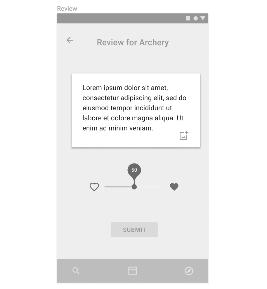
After the orientation, Rachel decides to leave a review for Archery event. In the review, she can input text, pictures and move the slider. The reason I chose the slider and the hearts is to reduce the amount of words she had to read. I personally don't like surveys that much, so I would keep the survey questions short. In this case, Rachel is more likely to leave an honest opinion.
------
High Fidelity
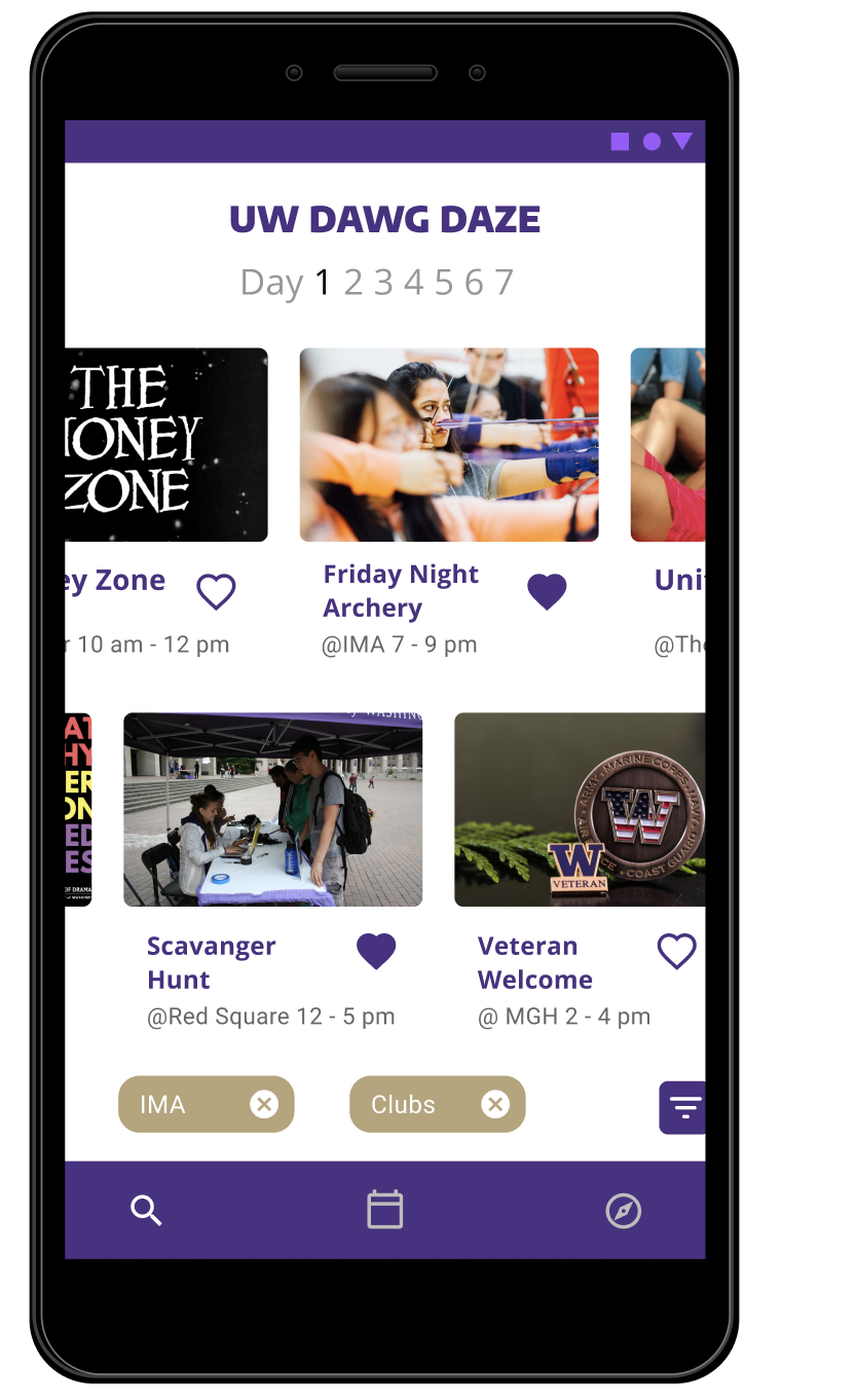
Reading text is too painful. Luckily most people like visuals. In the search page, users can view photos from the actual event with minimum text including title and time.
The user can scroll through events horizontally on an "endless" timeline. The event day increments at the same time.
Both rows of event will scroll at the same time since they're technically one giant row. All the past events are hidden from this timeline.
If the user is interested in an event, double click the event, the "heart button" turns solid and saves the event into scheduled events.
------
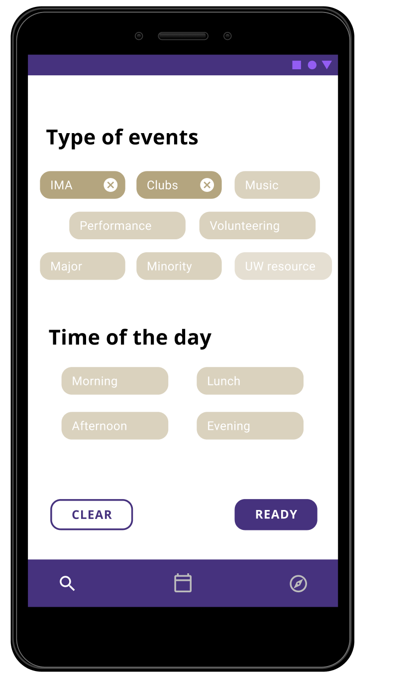
Filter is easy to use. Just click to add, and click again to remove. Notice the darker color labels are currently filtering.
The filter is by the type of events and time of the day. Since by user research, students don't really care about location as much.
In case the user changes one's mind, the "clear button" takes away all filters and shows non-filtered results.
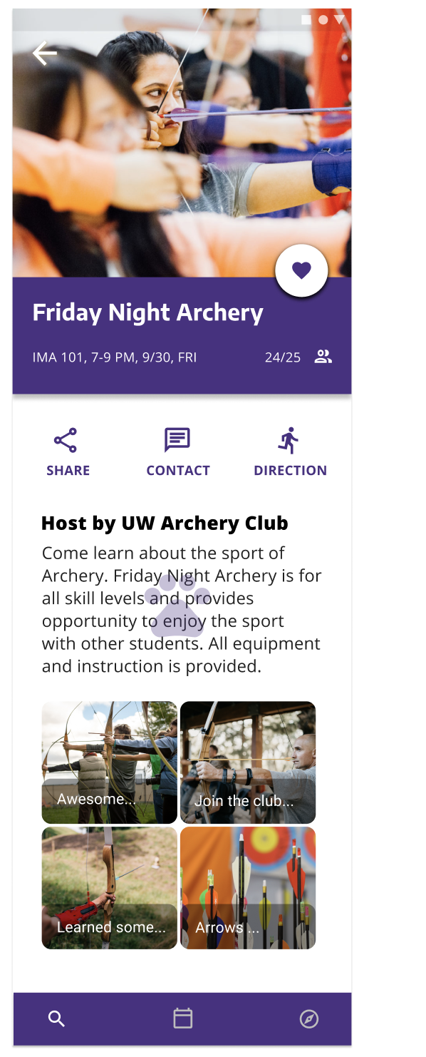
In the event page, I want the user to feel included in a community. The number of attendants and the host of the event tells the user, it's not a one time event, but it's reoccurring. The user will have the opportunity to make new friends and achieve a sense of belonging.
The "heart button" is the first few things user will see, so it will always be reminding the user to add the event.
The user can share this event with friends, so they can go together.
In case the user want to get in touch with the club, the "contact button" takes the user to the club information.
When the user clicks the direction, it will take the user to either Google Map app or web app. If the user has synced all the events to to Google Calendar, the user can use their Google Map app to plan routes.
The purple dawg print only shows up if the user checked in at the event. This function is for scavenger event at UW to help student learn building location.
Again, people like visuals. Images help user to see other people's experience.
Reflection
The key take away of this challenge is to design for improvement not for new system. For this challenge, I was designing an ecosystem. In addition to the event page, the user can rely on Google Calendar and Google Map to plan their event schedule. I see my design bridging the gap between the current orientation page and existing tools to provide a better new student experience.
The challenge I faced was narrow down a solution that would meet the most of user needs but simple to use. Honestly, I really missed team work. It took me longer to come up with ideas than a team would.
I chose to design for UW Dawg Daze because I'm a student at UW and I have the experience of orientation. I would say it was definitely memorable, eye-opening for a first year student. I actually thought UW did a good job coordinating events. I just wanted to make some improvements for the future students.
In a broader sense, the design should work for other universities. There're some things in common like present information clearly, include lots of visuals, and have empathy for new students. I think the add on is to include the school spirit.
If I would do it again, I would spend more time doing competitor analysis and information architecture. Due to the time constrain, I couldn't do as much research as I like.
------
Thanks for reading!
.jpg)